
PROBLEM
People started loan applications and didn’t finish them.
A consumer loan aggregator for India, built from zero as the only designer. Live in five months, then iterated for three years.
scrub 27 screens down to 10
74% is an absolute completion rate, not a lift. 3M+ installs in year one were marketing-led, so they aren’t claimed as a design outcome.
busy? this is the whole story
People started loan applications and didn’t finish them.
Ask once, ask late. Collect the shared core one time, defer the rest.
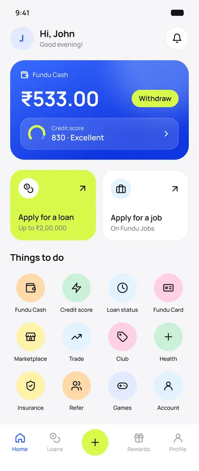
A ~10-screen flow, then a 10-surface ecosystem to come back to.
74% finished the application. Drop-offs fell by about a fifth.
That was the brief. No target, no defined user, no success metric. It started as a side project.
defining the problem was the first deliverable
01 · The brief
The parent company ran lead-generation campaigns for the competitors. That meant real performance data on the Indian lending market before a single screen existed.
Sat with marketing and analysed campaign performance across competitor accounts.
Ran hands-on teardowns of the competitor apps myself.
Looked at which messages converted, and for whom.
Higher literacy · larger ticket
Lower literacy · smaller ticket
personas came out of the evidence, not before it
02 · Research
27 screens, one input per page
Built as a questionnaire, not a form.
Every lender asked again
10+ lenders, each with different requirements. Apply to three, fill three sets of details.
The heaviest asks came first
Documents and verification landed before the user had seen a single offer.
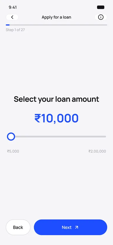
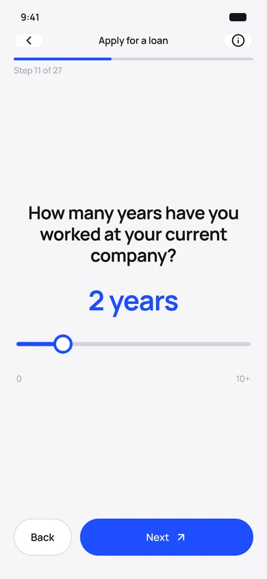
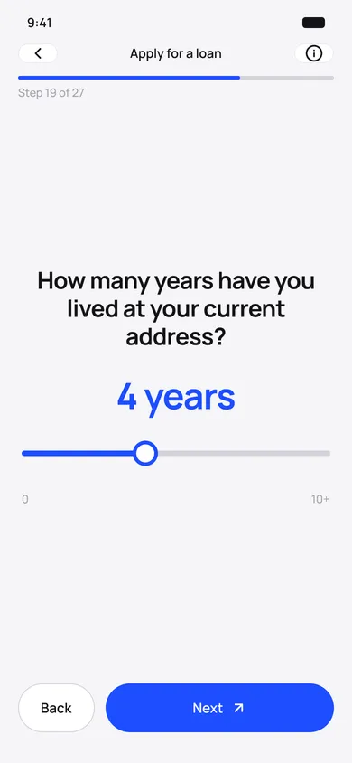
one question per screen, 27 times over
03 · The application problem
One common data core, collected a single time, then mapped to every lender’s requirements behind the scenes.
Common core
The shared set every lender needs, captured once at onboarding.
No repetition
Apply to any lender without refilling anything.
Deferred documents
Lender-specific uploads only after the user picks a lender.
Motivated ask
By then they’ve seen an approved offer and a real number.
the heaviest ask sits at the point of highest commitment
BEFORE · 27 SCREENS
AFTER · ~10 SCREENS
27 screens.
04 · The decision
74%
of users who started the application completed it
~20%
fewer drop-offs across the flow
Measured before and after in the marketing team’s funnel reporting. 74% is a completion rate; ~20% is a reduction. They are different kinds of number.
05 · Act 1 result
Loans are infrequent by nature. There was nothing to come back to, and an app nobody opens can’t earn beyond a single transaction.
06 · New problem
Instead of a banner, a categorised ecosystem, where the commercial inventory becomes useful surfaces rather than interruptions. It was my proposal in response to the banner request.
A single banner serves one interest to an audience with many.
Categorised surfaces mean every user has something relevant to open.
Relevance beats repetition: same inventory, placed where it’s wanted.
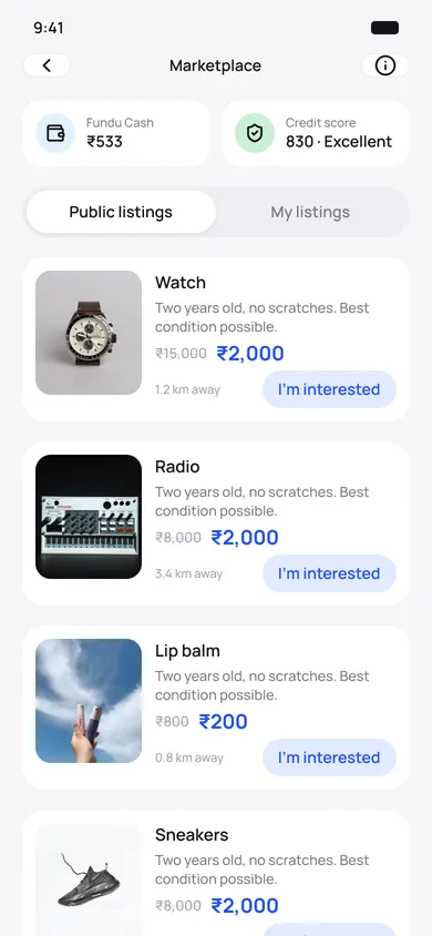
Sell and buy near you
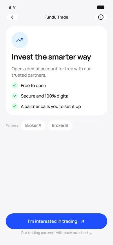
Open a demat account
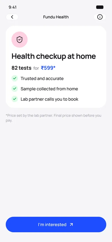
Health checkups at home
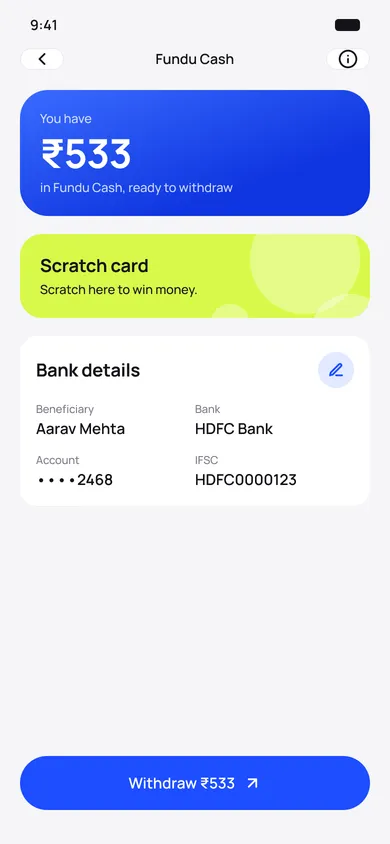
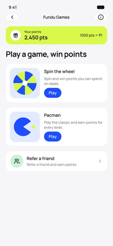
Points become real cash
same inventory, now something you’d actually open
07 · Banner → ecosystem
A tour of the shipped Android app, grouped by what people came to do. Swipe a row, tap any screen to open it full size.
Shipped 2020–21 · visuals refreshed 202608 · The UI, up close
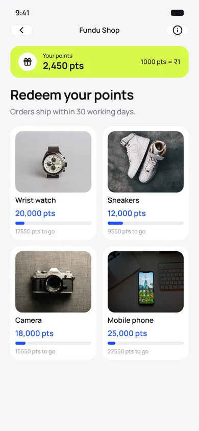
The thesis: loans are infrequent, so manufacture a reason to return. Play games, earn points, redeem them. Then the ecosystem shipped, and people had genuinely useful reasons to come back.
Paces inventory
Without it, a user clears every offer on day one and finds an empty screen the next.
Creates earned value
An offer you unlocked reads as worth more than one that was just sitting there.
“Wasn’t that just friction in front of ads?”
Playing was quick and optional, and the loan product was never gated. It only applied to the deals layer, which would otherwise empty in a single session.
09 · What I got wrong
74%
application completion after the 27 → ~10 restructure
~20%
fewer drop-offs
10
ecosystem surfaces shipped, solo
The app also reached 3M+ installs in its first year. That was driven by the parent company’s performance-marketing engine, so it’s company context, not a design claim. What happened after install was mine.
One profile, ten lenders
Users stopped repeating themselves.
A reason to return
A single-transaction product became a recurring one.
A second revenue line
Advertising inventory found a home users would actually open.
10 · Impact
Ambiguity is the design job
“Compete with a market leader” only became a problem because someone defined it.
Real utility wins
Real utility beats manufactured engagement. People return for things worth returning to, not for points.
Ask once, ask late
Collect the shared core one time; defer everything specific until the user is committed.
Evidence earns decisions
With no formal process and no authority, campaign data and funnel numbers moved the arguments.
11 · Takeaways
Same instinct, different world: let the evidence decide. Next, a project where the research rewrote the brief.
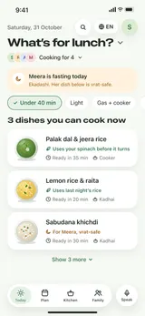
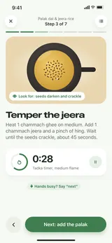
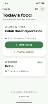
We were asked for a meal planner. The research said people don’t plan, they decide. So I designed for the decision.
57%of 99 surveyed don’t plan
51screens, solo


