


Fixing hiring workflows at scale.
Recruiters lost hours to duplicate candidates and slow shortlisting. I redesigned the hiring module end to end.
~40%faster task completion
60–70%faster shortlisting
A meal app for Indian home cooks. We were asked for a planner; the research said people don’t plan, they decide. I led the research across 10 designers, then designed the product solo.
← flip the brief, see what research said
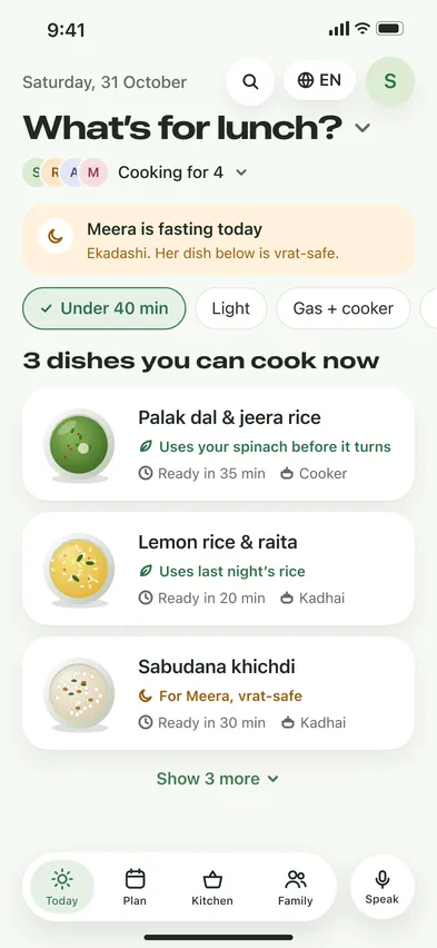
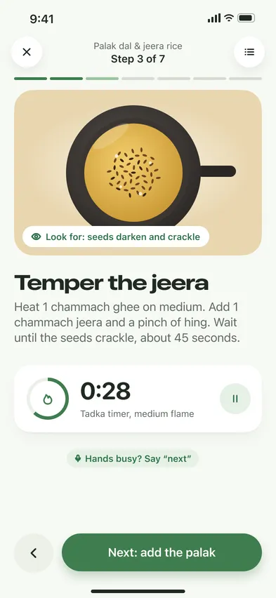
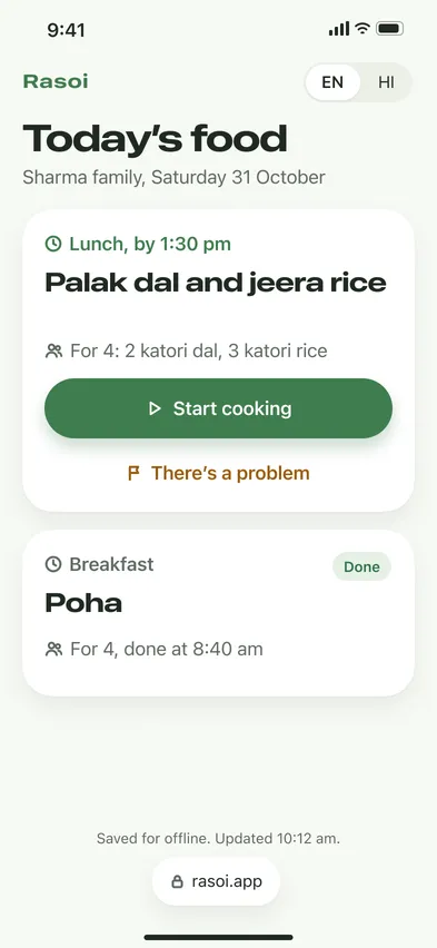
Plus 8 interviews, 3 run by me. Concept, not shipped: usability testing is next, so no outcome metrics are claimed.
The brief asked for a meal planner. 57% of people don’t plan meals at all.
Decide, don’t plan. The real pain is the next meal, two or three times a day.
Three dishes you can cook now, a pantry nobody maintains, and a link for the cook.
Not tested yet. A 5-person test of the two riskiest flows comes first.
That was the brief, for health-conscious people in India. It rested on one assumption nobody had written down: that people plan their meals.
01 · The brief
99 survey responses, 8 interviews, two benchmark matrices across 29 apps, and MyFitnessPal review mining. I assigned the methods, ran three interviews and owned the synthesis.
Assigned the methods
Each designer owned one stream, so nothing overlapped and nothing was missed.
Ran 3 interviews
Sunita, Rohan and Ayesha, so the synthesis wasn’t built only on others’ notes.
Owned the synthesis
71 evidence notes clustered bottom-up, with no themes set in advance.
Homemaker · cooks for the family
STRUGGLED WITH
Running out of tomatoes mid-cook; setup that took too long
NEEDED
Decide fast, from what’s already at home
Fitness professional · has a cook
STRUGGLED WITH
“I ask for a high-protein dish and get something random with paneer.”
NEEDED
A plan the cook can actually follow
Student starter
STRUGGLED WITH
Not knowing what’s in her fridge; apps built for fit people
NEEDED
Simple help, no tracking
02 · Research
One meal ahead
People plan in their heads. 57% don’t plan at all; 67% of planners do it mentally.
Nobody knows their stock
Tomatoes run out mid-cook, vegetables go bad in the basket. Nobody keeps an inventory.
Localization ≠ translation
54% are confused by ingredient names; 70% want local swaps; 56% still prefer English.
Two people, one plan
The person who plans often isn’t the one who cooks. Intent survives the handover; details don’t.
Rules belong to people
Fasting and diet rules are personal. Only 2 of 29 apps support fasting at all.
Every screen costs
90% never used a planner; 69% of those who tried quit within a week.
03 · What we found
57%
don’t plan their meals at all
69%
of people who tried a planner quit within a week
2 of 29
apps we benchmarked support fasting
The team started where the brief pointed: a week planner with a calorie tracker. I didn’t argue opinions; I put these numbers in front of the team. We reframed around the daily decision, and planning stayed as an optional tab, not the home.
The new question
How might we make the daily decision fast and confident, in the household’s own kitchen language?
North star
“Aaj kya banau?” answered in under a minute, with a dish you can cook right now.
Planning stays
A week plan is one tap away for the 25% who plan. Today follows it.
04 · The reframe
D1 · Today, not a plan
Three dishes you can cook right now. Rejected: a weekly planner home, a recipe feed.
D2 · Inferred pantry
Stock comes from shopping and cooking, fixed by a tap or a sentence. Rejected: manual inventory, fridge scan.
D3 · Three, with reasons
Each dish says why, like ‘uses your spinach’. Rejected: one ‘best’ dish, an endless feed.
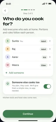
D4 · Five setup steps
Allergies are asked when a dish has one. Rejected: an 18-screen setup quiz.
D10 · A link for the cook
No login, in the cook’s language, with ‘There’s a problem’. Rejected: making the cook install the app.
D11 · Vrat per person
Fasting is a rule on a person; Today adapts. Rejected: a separate ‘vrat recipes’ section.
05 · Decisions
Every screen traces to a decision on the research board. All of it is built on Sage, my iOS design system: 23 text styles, 18 components, 32 icons.
Concept · iOS · 2026 · 507 component instances
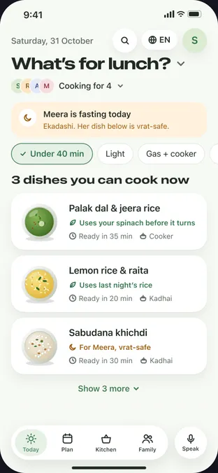
numbers match the markers on the screen
The UI, up close
The first set had one hero dish on the home screen and no Plan, Kitchen or Family. I tried richer illustration, then new typography. Neither worked, because the structure was wrong.
Structure before style.
Traced every screen
Each screen carries a note naming the decision it serves.
Audited the result
19 issues found. Contrast and tap targets were the majors.
“Wasn’t the audit just polish?”
No. It found that search existed but nothing on Today led to it, and that onboarding showed names nobody had entered. Both were fixed.
06 · What I got wrong
< 1 min
from opening Today to choosing a dish, the north-star job
Week 1
retention, against the 69% who quit planners in week one
No call
cook flags resolved in the app, not on WhatsApp
These are pilot measures, not results. First comes a 5-person test of the core loop and the cook handover: three homemakers, one household with a cook, one student.
v1 · test the riskiest
Today, recipe and cook mode, inferred pantry, the cook link, vrat per person.
v2 · for the planners
Week plan, self-building grocery list, leftovers feeding tomorrow.
Later · least evidence
Weekly nutrition nudge and fitness sync. Health had only two participants.
07 · How I’d know
Question the noun in the brief
‘Meal planner’ hid the real job. The best finding made the brief’s product optional.
Write down what you rejected
The rejected options kept the fridge scan and the calorie diary from creeping back.
Structure before style
Two rounds of visual polish couldn’t fix a home screen built on the wrong job.
Audit your own work
Measuring contrast and tap targets on my own screens found majors I had looked past.
08 · Takeaways
Same instinct, different world: question the brief, then let the evidence decide. That’s also the story of the HRMS work.
Recruiters lost hours to duplicate candidates and slow shortlisting. I redesigned the hiring module end to end.
~40%faster task completion
60–70%faster shortlisting